Griffin Theatre company Rebrand
The Challenge: Griffin has been dedicated to bringing the best Australian stories to the stage for the better part of four decades. Due to a decrease in attendance by younger audiences, Griffin is looking to inject new enthusiasm into their youth-led performance art.
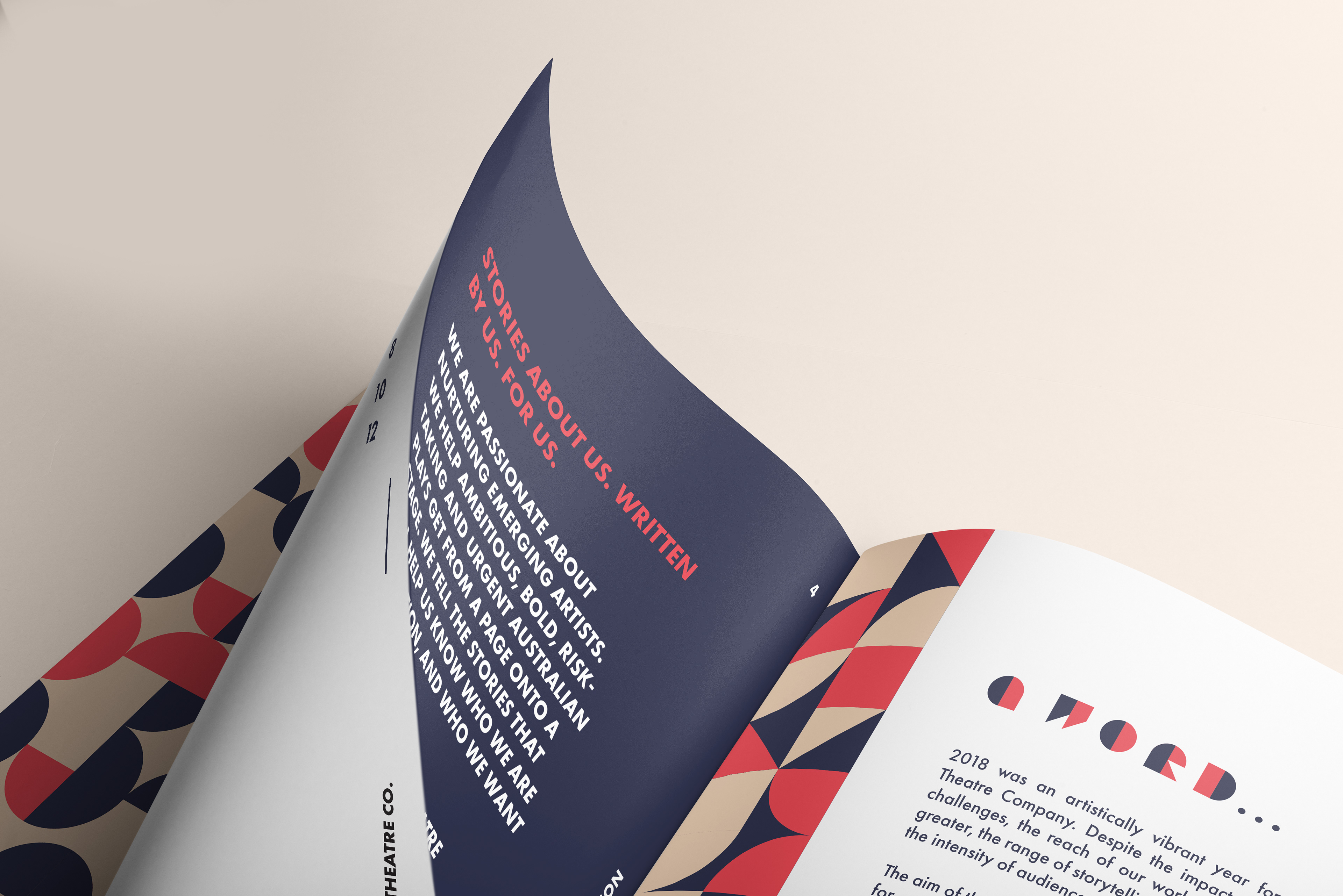
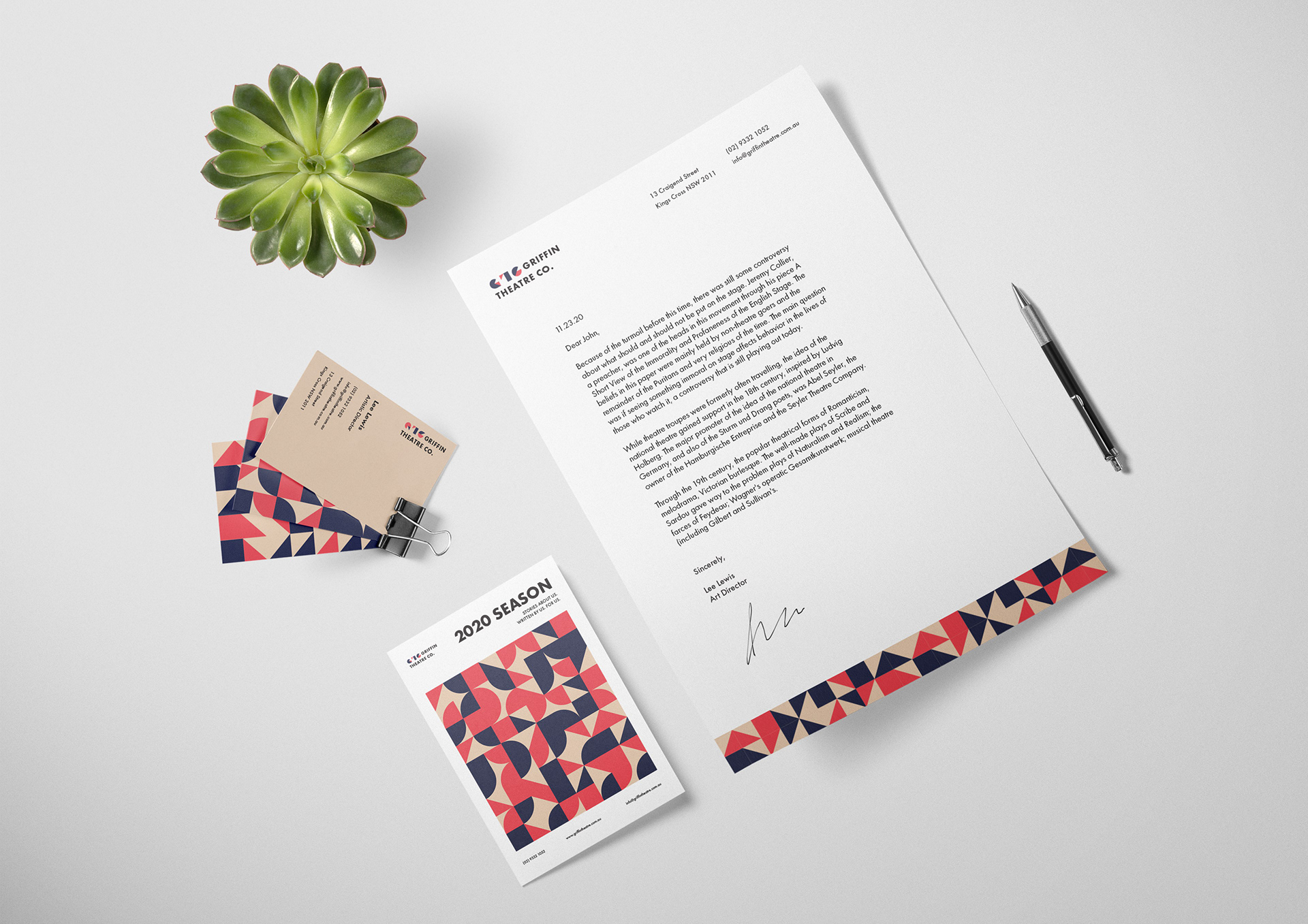
Solution: With the goal of attracting the attention of young theatregoers for the upcoming 2020 season, Griffin takes on bold geometric shapes and colours as the main building blocks for its brand identity and logo. These elements are playfully interwoven into patterns and custom typography, inviting viewers in for a closer look.
The series of posters illustrate the main themes and symbols of each play with an abstract geometric aesthetic. The visual identity is incorporated into the booklet layout for the 2020 season.